
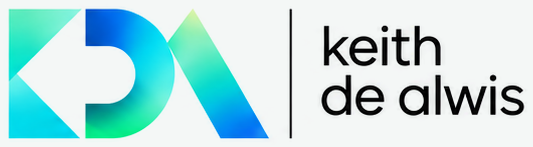
The mark is the KDA monogram, called Geometric Harmony: three letters cut from simple geometry. A K made of two triangles pointing inward, a D built from a stem and a half-round bowl, and an A reduced to a single leaning blade. Read together they point, hold and rise: the idea of connecting the pieces and moving forward. Each letter carries the luminous spectrum from logo-mint through logo-cyan to logo-blue, with logo-green at the base of the D and a logo-lime highlight at the apex of the A.
The wordmark sets "keith de alwis" in lowercase, on two lines, beside a thin vertical rule.
Versions (Logos group)
| File | Use it for |
|---|---|
kda-lockup-dark.png |
Primary. Colour monogram + white wordmark on bg. Site header, decks, email signatures, video end frames. |
kda-lockup-transparent.png |
The primary lockup on a transparent ground, for any dark background from bg to surface. |
kda-lockup-light.png |
Colour monogram + ink wordmark on white. Documents, proposals, invoices and the Paper theme. |
kda-lockup-paper.png |
The light lockup cropped tight and flattened onto Paper bg (#f4f7f6). Slides, proposals and documents in the Paper theme; only on #f4f7f6. Made from kda-lockup-light.png, not redrawn. |
kda-lockup-reverse-gradient.png |
All-white logo on the panel-start → panel-end gradient. Social banners and brand moments. |
kda-lockup-colour-field.png |
Primary lockup over the soft aurora field. Hero and cover imagery. |
kda-stacked-dark.png |
Monogram above a one-line wordmark. Square and portrait spaces, speaker slides, profile headers. |
kda-monogram-transparent.png / kda-monogram-dark.png |
Monogram alone. Social avatars, watermarks, when the name is already present nearby. |
kda-app-icon.png |
Glass tile with glow, radius-xl. App icon, favicon master, bookmark icon. |
kda-lockup-dark-16x9.png |
Full 16:9 frame for slide title and video end cards. |
kda-logo-sheet.png |
The master sheet: reference only, don't crop from it. |
Clear space and size
- Keep clear space on all sides equal to the width of the A blade at its base (about a third of the monogram height). Nothing (text, edges, other logos) enters that zone.
- Minimum sizes: horizontal lockup 120px wide on screen / 30mm in print; monogram 24px / 8mm. Below 24px use the app icon or a single-colour monogram.
- The vertical rule sits centred between monogram and wordmark; never remove it from the horizontal lockup.
Backgrounds
- Best on
bg(#080e10) and deep, low-detail dark imagery. - On white or
bgPaper, use the light lockup. - On the brand gradient or on busy or mid-tone photos, use the all-white version.
- Never place the colour monogram on a mid-blue or mint ground: the spectrum disappears into it.
Don't
- Don't retype, re-kern or change the case of the wordmark ("Keith De Alwis" in running text is fine; the logo stays lowercase).
- Don't recolour the monogram in a flat brand colour, invert the gradient, or apply the spectrum to the wordmark.
- Don't stretch, rotate, outline, add drop shadows or glows (the app icon's glow is the only exception).
- Don't rebuild the letterforms from the geometry here, and don't pair the mark with other logos without clear space.
These versions are high-resolution raster files taken from the brand sheet. Vector (SVG) masters from the logo designer should replace them for print and large-format work.